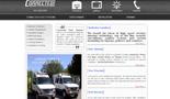
Responsive Designs
Responsively wireframed for mobile device
- S. Williams, Windsor Mill
Read our customers' testimonials about our responsive designs
We can adapt the layout of a website to the viewing environment of any screen size including mobile device. Within a few weeks, mobile searches will surpass Internet searches (if they have not already done so). Your site, regardless of your industry, will need a responsive layout. If you are interested in making your website "mobile-optimized", you came to the right place.
Designing a static website that works well on all browsers was acceptable until recently. Now with the exponential growth of mobile devices such as the iPad, iPhone and Android the use of responsive web design layouts is becoming an increasingly popular demand. Allowing layouts to adapt to different devices and their different screen sizes is a new technique that we have mastered.

Schedule a complimentary consultation with us to discuss reponsive layout for your new or existing website.
Call us in California at (707) 794-9999 Pacific Standard Time.

Wikipedia Definition:
Responsive web design (RWD) is an approach to web design aimed at crafting sites to provide an optimal viewing experience - easy reading and navigation with a minimum of resizing, panning, and scrolling—across a wide range of devices (from desktop computer monitors to mobile phones).
A site designed with RWD adapts the layout to the viewing environment by using fluid, proportion-based grids, flexible images, and CSS3 media queries, an extension of the @media rule, in the following ways:
The fluid grid concept calls for page element sizing to be in relative units like percentages, rather than absolute units like pixels or points.
Flexible images are also sized in relative units, so as to prevent them from displaying outside their containing element.
Media queries allow the page to use different CSS style rules based on characteristics of the device the site is being displayed on, most commonly the width of the Web browser|browser.
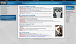
Mobile Device Layouts

Having a website with a responsive design is a must in today's business environment. More and more consumers are going to their mobile devices (Phone, iPad, tablet, laptop, etc ...) to search for a business, a product or service.

Regardless of who, when or how your website was designed, we can upgrade it to a responsive design which will make your site fluid according to the screen size and device used by your visitors.


To check out how Responsive Design works, you can test it on our website. Testing it is simple. Resize your browser to make it narrower and you will see that the page you are on will automatically change design, format, and information. This means that when someone views our site on a mobile device, like the popular iPhone, our website will be "thumb ready".